The US COVID19 Pandemic and S-Curves

Around March 25 the US became the poster child for the COVID19 Pandemic. This graphic from the Financial Times Tracking Site tells the sad tale. America is again number one! =(

source:ft.com

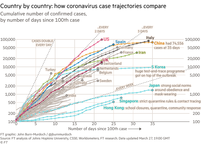
Note that when I first blogged about COVID19 back on March 1st there were only 62 reported cases in the US!

At the time I’m writing this, the State of Florida is just getting around to effective measures. The official count is currently only 2,900 cases but that is certainly off by a factor of ten or more! (In the US we’ve done an appalling job of testing for and controlling exposure to infected people.)

This graphic appeared on Twitter yesterday…

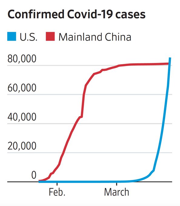
It got me thinking… wouldn’t it be more effective it it were inverted? So I gave it a shot…

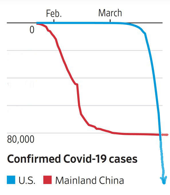
Doesn’t that look more intimidating?! Imagine the longest, steepest rollercoaster you’ve ever been on, or maybe falling off a cliff. (You’ll notice I also added an arrow to emphasize there is currently NO BOTTOM to this curve!)

S-Curves

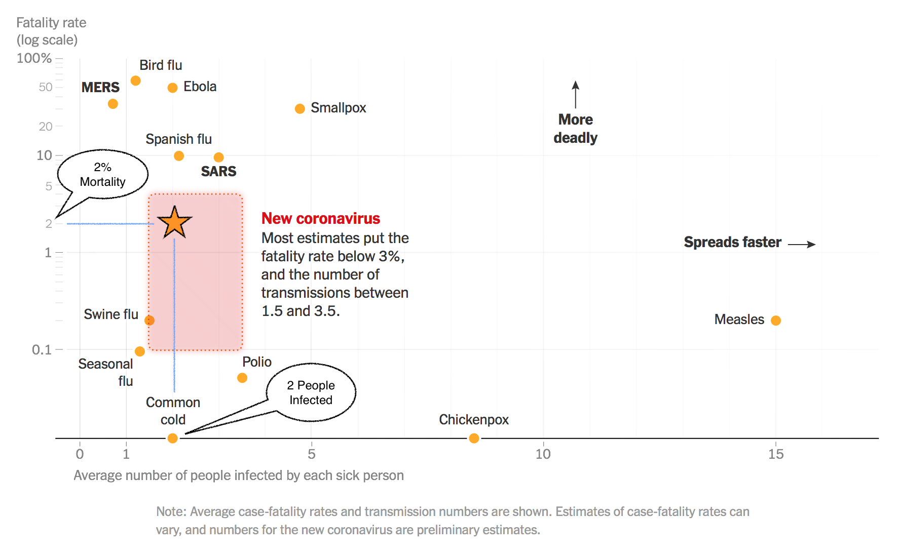
This put me in mind of basic epidemiology from medical school and even well-taught high school biology. Every Epi textbook has a graphic that looks something like this…

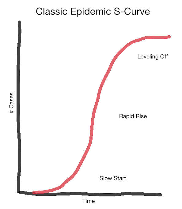
This is the classic “s-curve” of epidemic spread. Things start slowly, but quickly speed up due to exponential growth. Our trajectory in the first graphic is DOUBLING every 2-3 days!

At some point the curve flattens because public health efforts are working–or all potential hosts are either infected or dead!! The curve for China in the second graph is roughly s-shaped and they’ve successfully made it to the leveling off phase (for now).

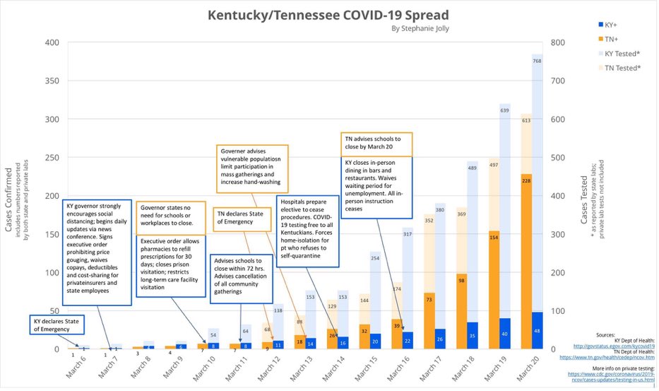
Some States are doing a better job at flattening the curve through common sense public health efforts. Compare the dark bars in this graphic. [Larger Version] Kentucky (blue) took more aggressive steps earlier. Contrast this with Tennessee (orange), which by March 20th had over four times more confirmed cases!

source:twitter.com

That brings us to TESTING for the virus. The classic curve informs who we should test and when. Early testing helps identify individuals with the virus so they can be isolated from the population at large. (Remember, many of these people are not obviously sick.) This is referred to as the Containment Phase. In the US we did not/could not do adequate proactive testing due to a cascade of technical, regulatory, and political missteps. [Link to More Info]

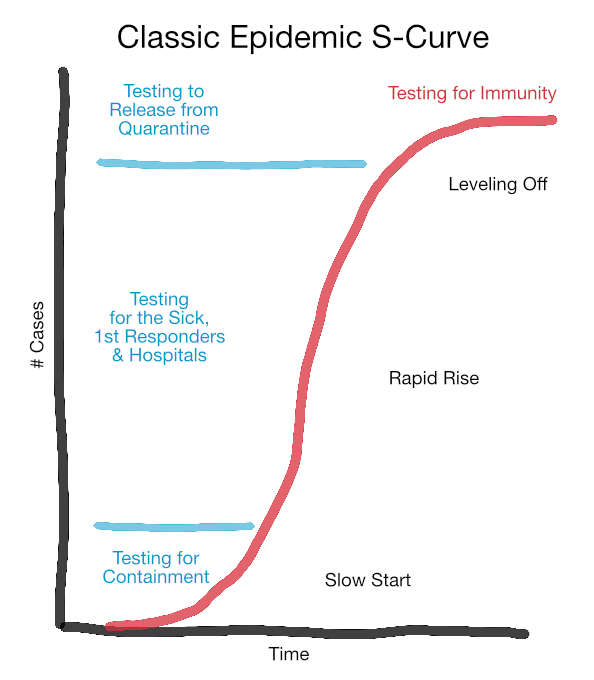
Failure to test enough of the right people early lead us to where we are now, Epidemic Spread. No one knows how far we will progress before the curve starts leveling off. This is a scary place to be, a bit like looking over a cliff edge into the abyss. The focus of testing is now on those who are ill, first responders, and healthcare workers at all levels.

Once we reach the point where the total number of new cases begins to drop, testing again becomes important to ensure containment, identify people who can go back to work, etc… This will also be the time to start a different sort of testing (for antibodies) to gauge who is immune, and who remains susceptible to new infection.

Epidemiologist’s Worst Nightmare

To help illustrate how the US Epidemic spread I’ll link to this fascinating video from a data visualization company. They started with anonymous cell phone “ping” data from a small segment of beach in Fort Lauderdale during Spring Break.

source:youtube.com

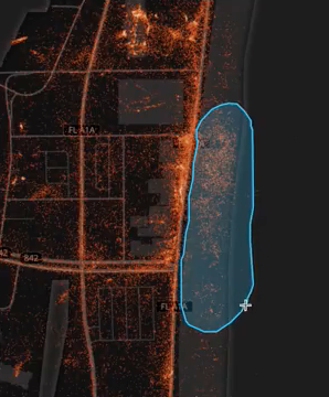
As these few hundred individuals took themselves (and their phones) back home, look at the result (called a Heat Map)!

source:youtube.com

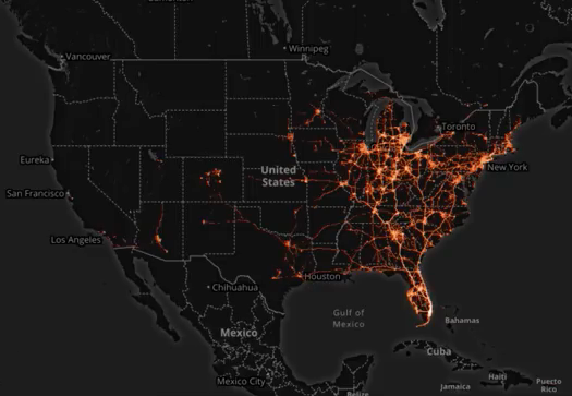
This is an epidemiologist’s worst nightmare! A similar scenario could be expected from this year’s Mardi Gras. The Governors of Florida and Louisiana should both be held accountable for not closing these infection pipelines down!

Review of Pandemic (The Game)

I bought this award-winning board game about three years ago not guessing how relevant it would become. Now that many of us are sheltering in place from COVID19, what could be better than a science-based game where the goal is to cooperate in order to defeat life-threatening viruses!

The game is designed to mimic the behavior of contagious diseases which if left unchecked kill thousands of people (sound familiar?). There are several mechanisms to spread germs from one locale to another. Individual cities can become quickly overwhelmed (“outbreaks” in the game’s terminology). Outbreaks add to a “burden of disease” tracker on the side of the board. If you reach the final skull-and-crossbones–it’s game over!

source:@thatbgshow

The game unfolds quickly by drawing “infection” cards with names of cities onto which you place infection markers (small colored cubes). Several events can occur that will accelerate these infections to the point they become outbreaks (as outlined above).

Pushing back on this process is the actual game play. Each player has a special role (medic, researcher, etc.) with special abilities. Unlike most games the point is to maximize the benefit for everyone. This leads to discussion and cooperative problem-solving.

Pandemic is appropriate for older children, works best with four players, and takes less than an hour to complete.

Thoughts on the Approaching COVID19 Pandemic

source:nytimes.com (click to enlarge)

I’ve annotated this NY Times graphic, rounding the estimates for COVID19 (aka the 2019 novel coronavirus) to 2% mortality and 2 people infected for every one who has the disease. What this suggests is the infection rate will be similar to a bad cold season, but unlike the common cold, a significant number of people will die of the disease.

This is not good news, but it is also not catastrophic.

By comparison the 1918 “Spanish” Flu had a similar infection rate but killed 1 in 10! The 1918 Flu infected approximately one third of ALL the people on earth… and that was before air travel!

Based on these numbers alone, up to 110 million people in the US could be infected. 80% of these cases should be mild, 20% will need some form of special care in hospitals or at home, and 2% (2.2 million) could die.

One area where the 1918 Flu differs from COVID19 is the latter does not seem to kill children, which is a small bright spot. However, children may be a source of infection for vulnerable adults!

Note that the currently reported mortality rate is over 3% but here in the US we have done almost NO testing, so the total number of infected individuals is unknown, but likely to be much higher. This means the reported mortality rate is probably inflated due to lack of good data. I’ll stick with 2% as a conservative figure for now.

It is also important to remember one of the lessons of the 1918 epidemic, things may look better when warmer weather returns but this should not be reassuring. In the spring of 1918 it looked like the disease was weakening, but it returned with a vengeance in the fall and winter!

Social Isolation and Hand Washing

For the general public, not living with or caring for a sick person, wearing masks really doesn’t help. Social isolation (eg, staying home) and effective hand washing remain the best things you can do to prevent getting most viral respiratory diseases (the common cold, influenza, and the new coronavirus). Just being in the same room with a sick person is not that risky, but touching surfaces and objects in that room and then touching your face is a good way to catch one of these viruses. Note that hand washing studies suggest we generally neglect our fingertips (including the nails) and wrists.

The best information available comes from CDC and WHO (which I consider the best source since it is not caught up in US political shenanigans). For up-to-date worldwide information download the most recent WHO Situation Report.