
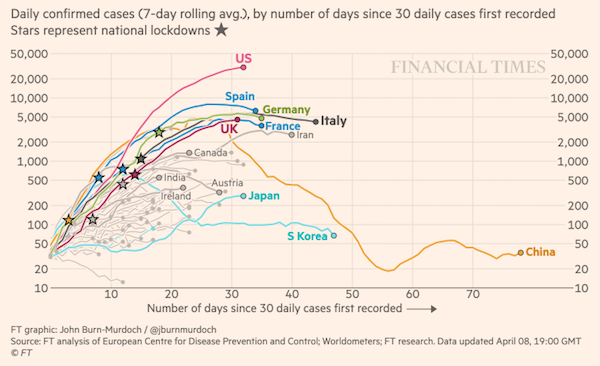
Two graphs of COVID19 data today illustrate an important data communication problem… the use of logarithmic scales (aka log scales). The Financial Times daily Coronavirus Tracker is great, but the use of log scales in their graphs makes the visual difference between 10-20 the same as 1000-2000. These graphs fail to communicate how bad things really are!
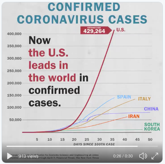
Compare with the @CAPAction presentation of the same data using a non-log vertical axis . The situation in the US looks much worse (and, oh by the way, it is!).
Given the level of numeracy of the average US citizen, I think we should avoid log scales in public discourse whenever possible.