Around March 25 the US became the poster child for the COVID19 Pandemic. This graphic from the Financial Times Tracking Site tells the sad tale. America is again number one! =(
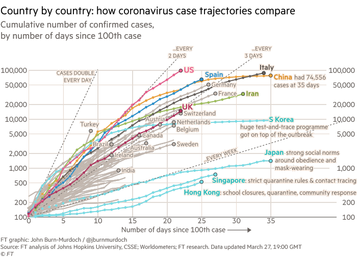
Note that when I first blogged about COVID19 back on March 1st there were only 62 reported cases in the US!
At the time I’m writing this, the State of Florida is just getting around to effective measures. The official count is currently only 2,900 cases but that is certainly off by a factor of ten or more! (In the US we’ve done an appalling job of testing for and controlling exposure to infected people.)
This graphic appeared on Twitter yesterday…
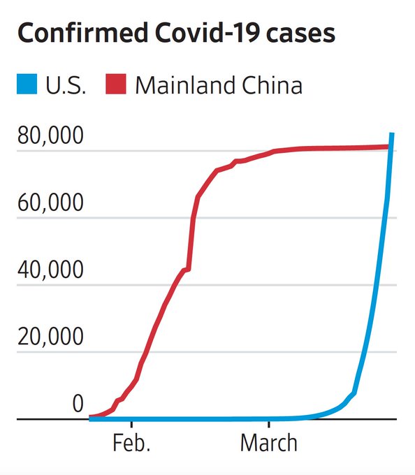
It got me thinking… wouldn’t it be more effective it it were inverted? So I gave it a shot…
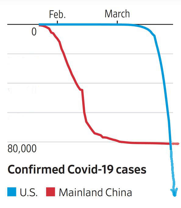
Doesn’t that look more intimidating?! Imagine the longest, steepest rollercoaster you’ve ever been on, or maybe falling off a cliff. (You’ll notice I also added an arrow to emphasize there is currently NO BOTTOM to this curve!)
S-Curves
This put me in mind of basic epidemiology from medical school and even well-taught high school biology. Every Epi textbook has a graphic that looks something like this…
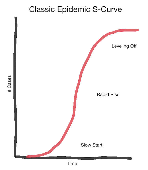
This is the classic “s-curve” of epidemic spread. Things start slowly, but quickly speed up due to exponential growth. Our trajectory in the first graphic is DOUBLING every 2-3 days!
At some point the curve flattens because public health efforts are working–or all potential hosts are either infected or dead!! The curve for China in the second graph is roughly s-shaped and they’ve successfully made it to the leveling off phase (for now).
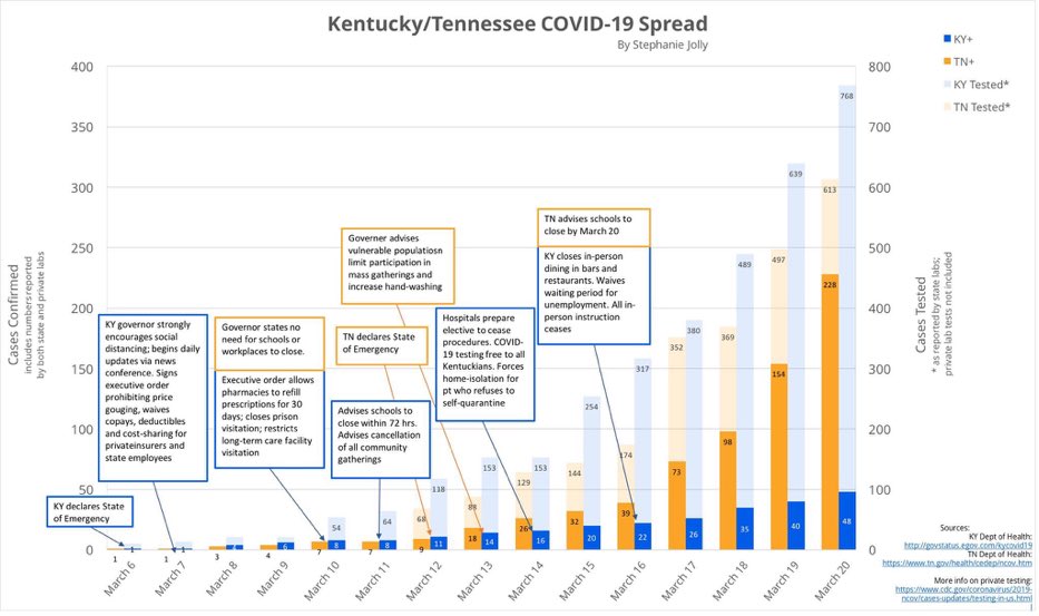
Some States are doing a better job at flattening the curve through common sense public health efforts. Compare the dark bars in this graphic. [Larger Version] Kentucky (blue) took more aggressive steps earlier. Contrast this with Tennessee (orange), which by March 20th had over four times more confirmed cases!
That brings us to TESTING for the virus. The classic curve informs who we should test and when. Early testing helps identify individuals with the virus so they can be isolated from the population at large. (Remember, many of these people are not obviously sick.) This is referred to as the Containment Phase. In the US we did not/could not do adequate proactive testing due to a cascade of technical, regulatory, and political missteps. [Link to More Info]
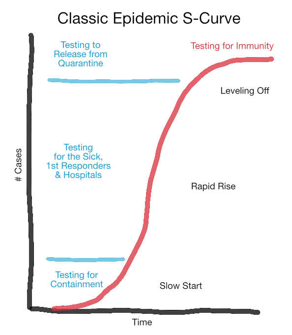
Failure to test enough of the right people early lead us to where we are now, Epidemic Spread. No one knows how far we will progress before the curve starts leveling off. This is a scary place to be, a bit like looking over a cliff edge into the abyss. The focus of testing is now on those who are ill, first responders, and healthcare workers at all levels.
Once we reach the point where the total number of new cases begins to drop, testing again becomes important to ensure containment, identify people who can go back to work, etc… This will also be the time to start a different sort of testing (for antibodies) to gauge who is immune, and who remains susceptible to new infection.
Epidemiologist’s Worst Nightmare
To help illustrate how the US Epidemic spread I’ll link to this fascinating video from a data visualization company. They started with anonymous cell phone “ping” data from a small segment of beach in Fort Lauderdale during Spring Break.
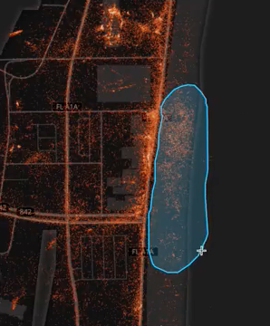
As these few hundred individuals took themselves (and their phones) back home, look at the result (called a Heat Map)!
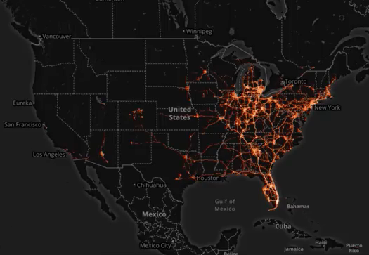
This is an epidemiologist’s worst nightmare! A similar scenario could be expected from this year’s Mardi Gras. The Governors of Florida and Louisiana should both be held accountable for not closing these infection pipelines down!
