The Eclipse
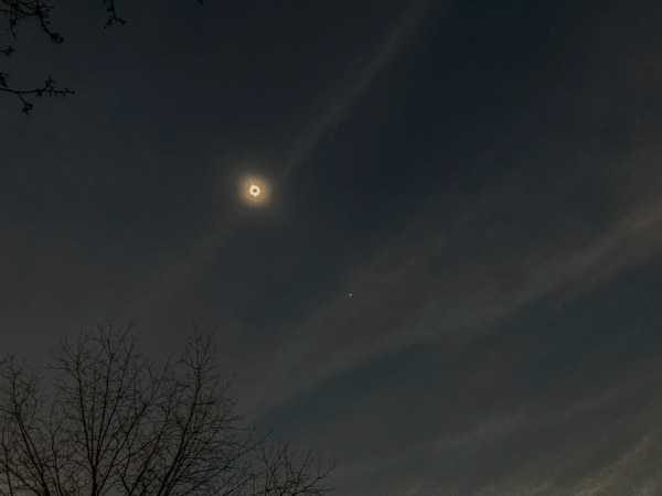
Last week I traveled with my Sister Diana to Southern Illinois hoping to experience the Total Solar Eclipse. We were not disappointed! We had mostly blue skies that day with some high stratus clouds. Nothing can really prepare you for the moment of totality. We could suddenly see “stars” (actually the planets Venus and Jupiter) in the odd twilight. It got perceptively cooler and the wind changed direction.
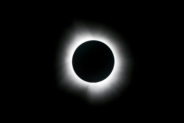
Two things stand out in the photo above. The first is the Sun’s Corona, which is only visible to the naked eye during an eclipse. The second is the little bright spot near the bottom. This was a constant feature throughout and on higher resolution photos appears to be a Solar Prominence (a plume of hot gas streaming from the surface).
The Snake Road
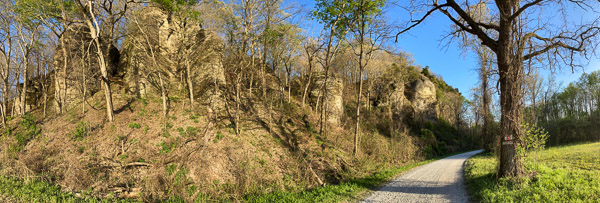
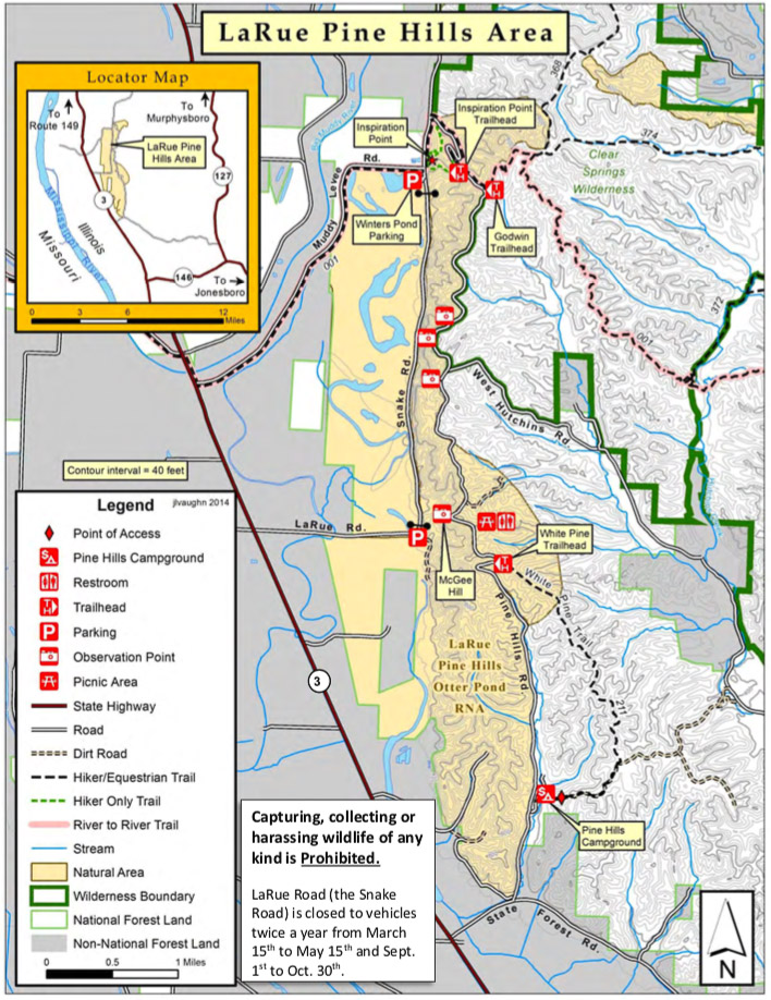
I read about the “Snake Road” a year ago and intended to got there at some point. The Eclipse was over by 2:15pm so we had the time and decided to find it. The area is called the LaRue Pine Hills Natural Area and consists of a crumbling limestone cliff above a flat river valley. The cliffs face the afternoon sun and offer many nooks and crannies for snakes to hole-up for the winter. Hundreds of Snakes cross the road below the cliffs in the Spring and Fall, which is closed to traffic at those times. [Photo Gallery]
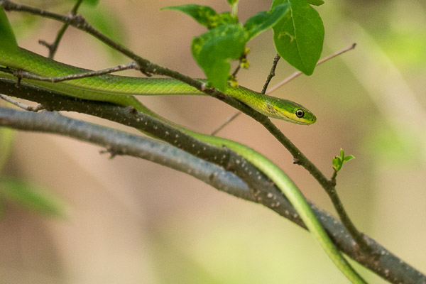
We were there at the right time of year, but the wrong time of day to see snakes. Luckily we did see a Green Tree Snake before we started to climb the cliff.
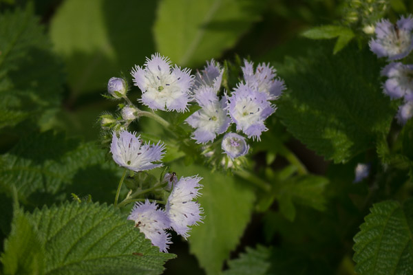
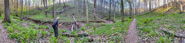
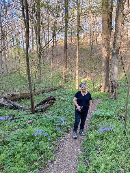
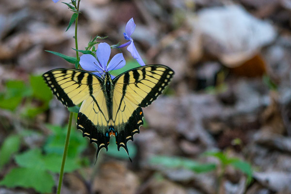
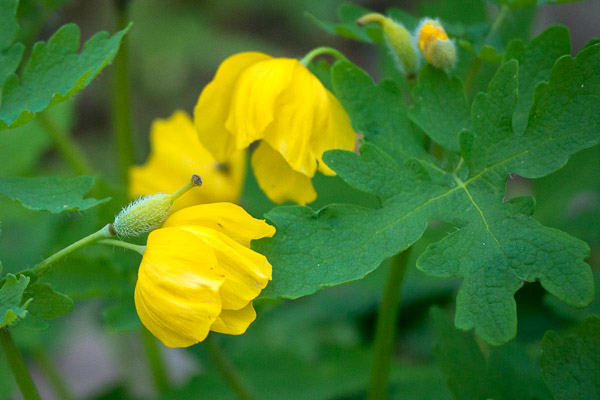
We left the road on a side trail where we saw several different types of wildflowers in bloom as we ascended to the ridge line.
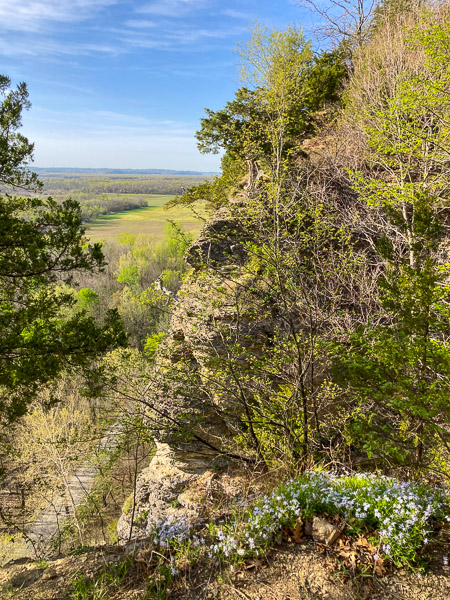
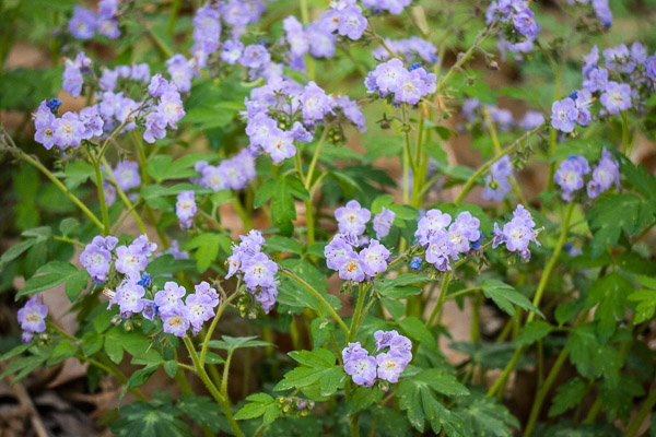
Somewhere near the “top” we paused to take in this spectacular view! The blue flowers in the foreground are Cleft Phlox.
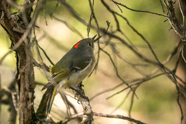
A small bird in the dense undergrowth caught my eye. This turned out to be a Ruby-Crowned Kinglet which allowed me several minutes to take pictures. First time I’ve seen its “crown” in the wild!
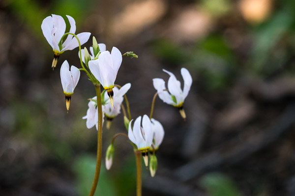
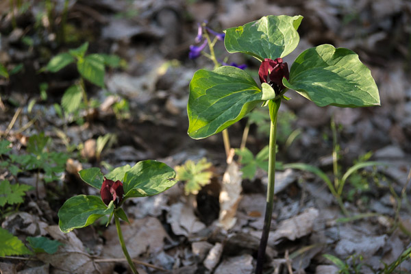
We then descended into a long ravine behind the cliffs bedecked with wildflowers and ferns.
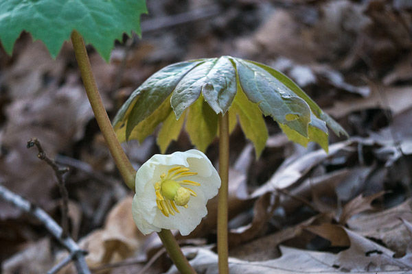
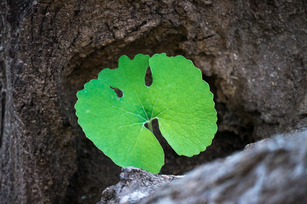
While not yet in bloom, the distinctive leaves of Bloodroot were everywhere, including this hollow log.
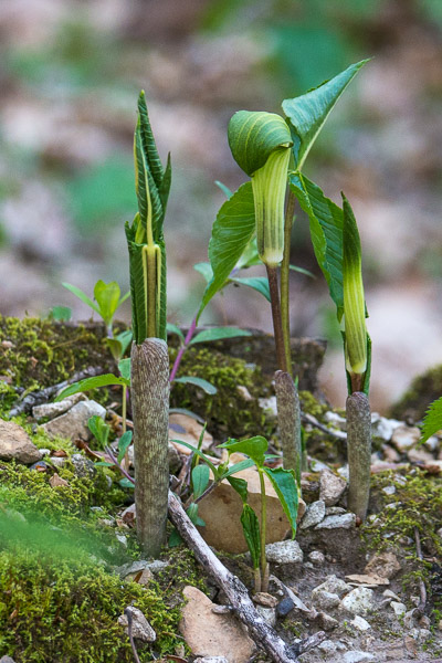
These emerging Jack-in-the-Pulpit reminded us of tube worms on a coral reef.
Finally we came down to the frontage road and had a pleasant walk back to the car.