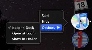
Windows has the Task Bar, OSX has The Dock. I spend a great deal of time tracking issues, projects, and resources on the Web. I might have four windows open with multiple tabs in each, and I might have minimized some or all of these into the Dock. Same for email. So what happens when I need a new window? In OSX 10.5 there was a Dock menu for each application, with convenient commands such as “New Window” or “Compose New Message“. Alas this is no longer the case in 10.6 “Snow Leopard”. Now each app has a minimal menu of rudimentary commands…

If I click on the application icon in the Dock, at least one of the minimized windows undocks itself and becomes the focus. This is never what I want. If I wanted to undock a window I would have clicked on that window’s icon instead.
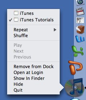
To add insult to injury, what’s with the hierarchical submenu?! Why can’t “Options” just be part of a single menu? Given the size of the average computer screen these days… why are we still forced to navigate hierarchical menus? Here’s the same menu in 10.5…

This is obviously much better!
Dec 22, 2010 Update
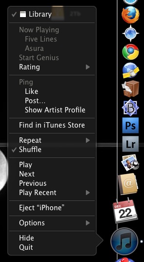
I stumbled upon the menu I was looking for with a right click!
Now the UI makes more sense. Left click is about window management, and right click is about function. I still don’t understand why Remove from Dock, Show in Finder, etc. are in a submenu?!

